Logo Design – Haunted Ozarks
Posted by Judah on Mar.31,2013 in Design, Logo Design with 0 Comments
Client: Haunted Ozarks
Project: Logo Design, Haunt Attraction Graphic Design, Illustration
I often state I have fun with a certain project, but when I say it about this project it means something a little different. I was first approached because my online drawings, doodles and art garnered attention. The owners were certain that my artistic style was a perfect fit for the new haunt that would be in Hollister, MO.
Logo Design Challenges
The haunt owners wanted the haunt company (Haunted Ozarks) to be branded by itself so that it could be distinguished from the year-to-year haunt themes. The Haunted Ozarks brand needed to be immediately recognizable, but also have flexibility for future haunt themes. The Haunt themes would change, whereas the logo needed to remain the same, and they all needed to work in concert.
Logo Design Solution
Given the subject matter, this logo screamed for a hand-drawn illustration style (no pun) and a spooky set of glaring eyes. The solution would be eyes that also stood in as letter forms. The process involved a series of ink doodles to experiment with various eye and font combinations. Once the drawings landed on the existing “HAUNTED” eyes and font, the rest of the project was down hill!
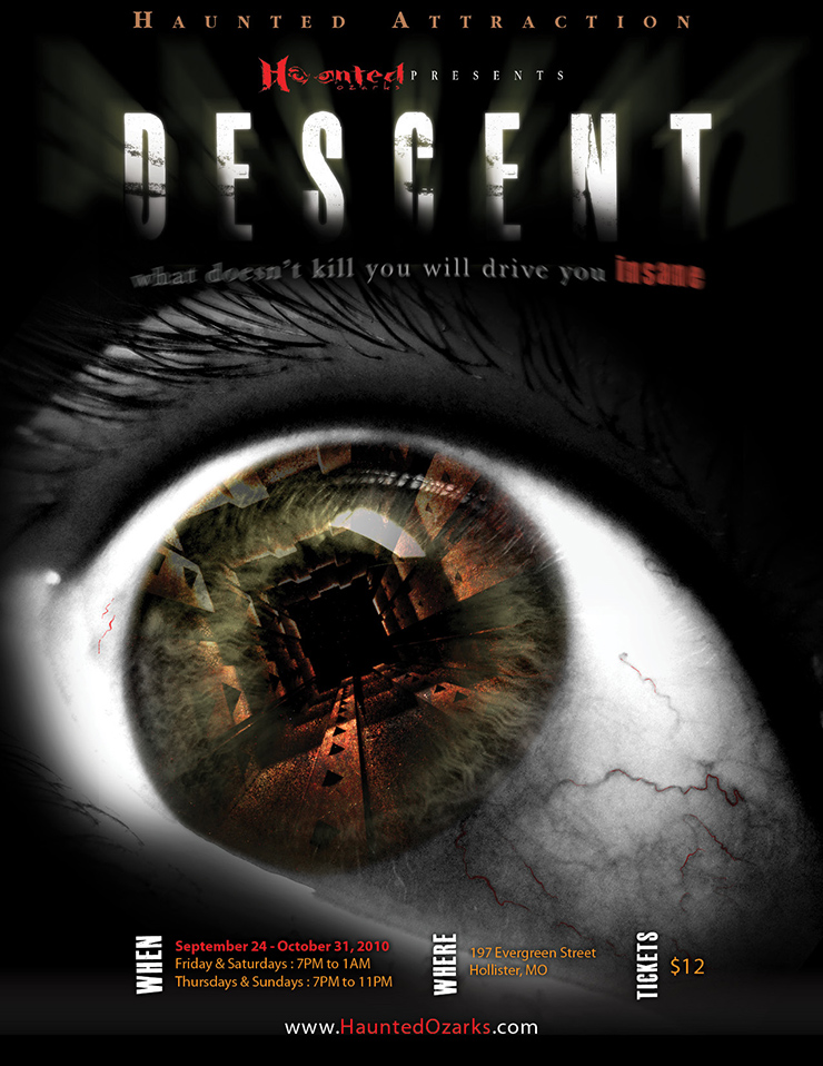
The first haunt also included web design, event graphics design and poster design. The posters were so popular that people were literally stealing them – a strange problem to have for promoters! (Is that good or bad?). See below:
- Explore (if you're curious)